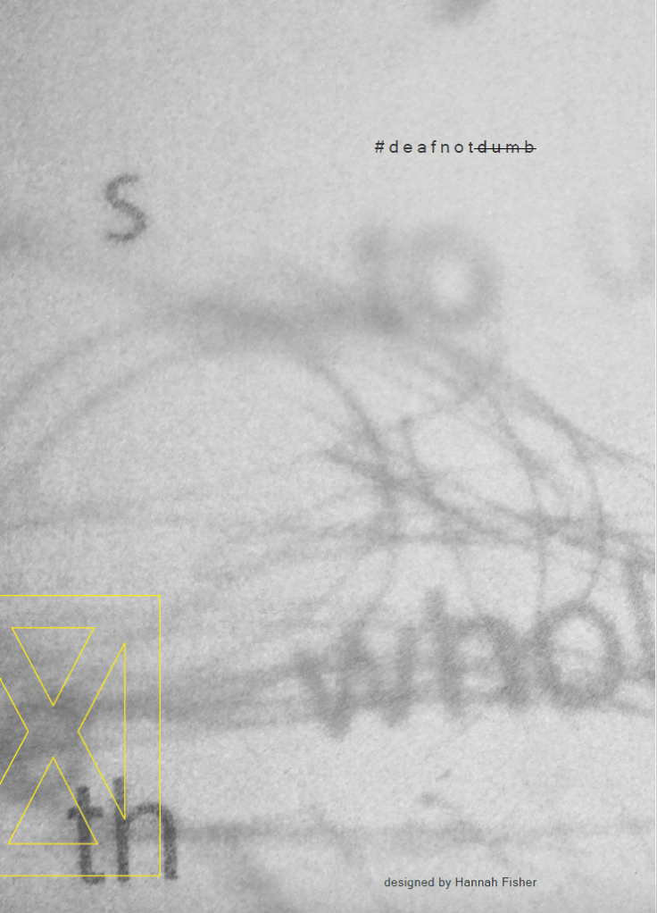
Eight years ago I made a zine about being deaf.
It formed part of my final major project at uni during the first covid lockdown, and I remember presenting it as a design thing, typography-led, visual communication, all that, because it felt safer than admitting I was essentially trying to pin down a lived experience I was tired of explaining. I called it Deaf Not Dumb, which I still stand by as a title. It’s blunt, slightly confrontational and it says what it needs to say without dressing it up
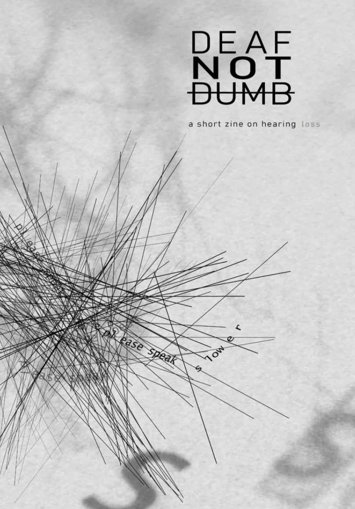
Looking back at it now after all these years, what’s strange is how familiar it still feels. Not because everything is exactly the same, but because the texture of it is recognisable. The stop-start nature of conversations, the constant little translations you do without even noticing, the way you can be completely capable and still end up being treated like you need extra handling because communication isn’t seamless. None of that is dramatic, it’s just constant, and the zine captures that without trying to be inspirational about it.
A lot of the pages sit between calm and interference. There’s clean type, controlled spacing, and then these harsh lines cutting across the spreads. Those lines are tinnitus. They’re not decoration and they’re not there because I wanted it to look “edgy”. I live with tinnitus alongside hearing loss and it has always felt like something running underneath everything else, present even when the world is quiet, impossible to switch off, occasionally easy to ignore and then suddenly impossible. I don’t know how you’re supposed to describe that in words without sounding like you’re being dramatic, so I did what I always do and made it visual instead. There’s also a spread where PAUSE is printed with the S faded out. That’s deliberate too. People with my hearing loss struggle with higher pitch sounds, and “S” sits in that sharper frequency range, so the missing letter is literally what it can feel like: you get the shape of the word, you get most of it, but the detail drops out. It’s subtle enough that it reads like a design choice, which is exactly why I like it, because that’s how most of this stuff functions in real life as well. You miss something small, you fill it in, you carry on, and then you do that about a thousand times and wonder why you feel tired after a normal conversation.
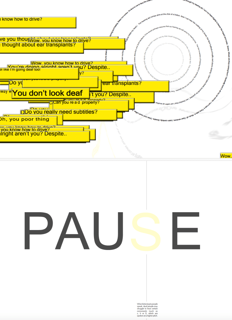
The yellow runs through the whole thing as a kind of emphasis. Not cheerful yellow, more highlighter yellow, the colour of something being underlined, flagged, made impossible to ignore. Some spreads are almost swallowed by it, and others just have these sharp blocks of yellow holding text in place, which makes the pages feel a bit more like they’re speaking back. It’s hard to explain, but it gives the work that slightly tense, slightly electric quality that I associate with being very aware of yourself in social situations. You can be fine, then you miss something, then suddenly you’re hyper-aware, and then you’re back to being fine again, pretending it didn’t happen.A few of the spreads are built around the things people say. Not necessarily cruel things, but the kind of comments that come out casually, confidently, like they’ve never been considered properly. “You don’t look deaf.” “Wow, you speak so well.” “Do you really need subtitles?” “Never mind, I’ll tell you later.” They’re often said with a smile, which is partly why they land so oddly. The zine isn’t trying to make those people villains. It’s more that it shows what happens when you hear versions of the same lines for years, and how it becomes a background track that shapes how you behave, how much you disclose, and how willing you are to ask for what you actually need.
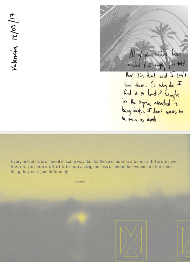
The most personal page is the diary extract from Valencia. Reading it now is still uncomfortable, not because it’s tragic but because it’s honest about something I still recognise: the moments where telling someone you’re deaf would make everything easier, and you still don’t do it because you can’t be bothered with the reaction that comes next… the emotional part. The sudden shift in how you’re treated, the pity face, the over-enunciation, the babying, the awkward apology loop, the assumption that you need everything slowed down rather than simply communicated clearly. Sometimes you’d rather just get through the situation without turning yourself and/or your hearing los into a topic.There’s a line in there about not wanting to be seen as dumb, and I hate that it’s true, because it shouldn’t be a fear you have to manage at all, but it is one of the quieter realities that sits underneath a lot of deafness. Not the deafness itself, but the way people interpret it, and the way you learn to anticipate that interpretation before it even happens.
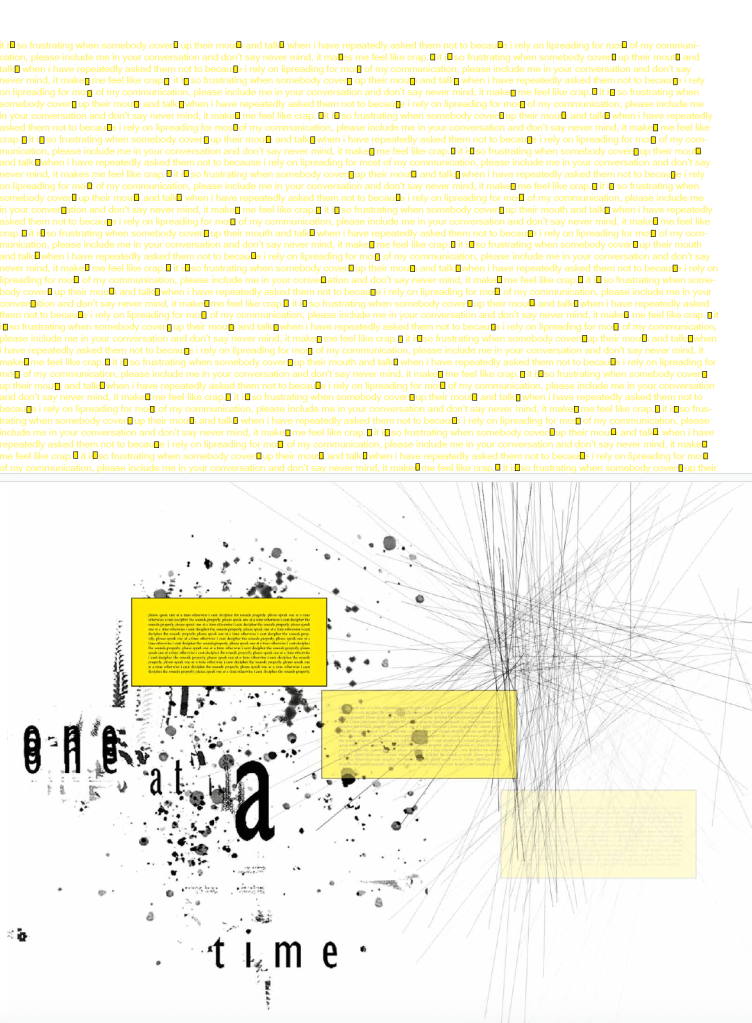
I’m sharing the pages now because it feels like part of my archive, and because it’s oddly reassuring to see that I was able to make something coherent out of an experience that often isn’t. It’s not perfect, it’s not neat, and it doesn’t try to be palatable. It just documents something real and leaves you to sit with it.If you’ve read this far and you’re deaf or hard of hearing, I’d be interested to know what your equivalent of the faded “S” is, the sound or the moment that other people assume is nothing, but for you is where things start slipping.
Seeing this zine again has made one thing obvious: I’ve never stopped wanting to create. I’ve just been putting it off because work takes the energy and life takes the rest. I’m changing that. I’m revisiting the creative side of my life properly, and soon. Consider this the start of me making things agai
n.